What Are the Key Principles of Effective Website Navigation?

Website navigation may seem like a minute detail amidst the sea of tasks you need to tackle when building your business website. However, a user-friendly navigation setup can be the difference between your visitors becoming customers or ditching your website altogether. Let's explore this often overlooked but critically important feature a little more.

The Challenges of Website Navigation

Let's begin by understanding the common hurdles business owners face when trying to perfect their website navigation:

  1. Complex Site Structure: It's natural to want to include as much information as possible about your business on your website. However, the danger here is developing a site structure that is convoluted and confusing for visitors. An unclear site structure leads to visitors struggling to locate the information they need, causing frustration and, ultimately, site abandonment.
  2. Non-Responsive Design: We're living in a mobile-first world where your website needs to function seamlessly across various devices. A non-responsive design means that your website's navigation doesn't adapt well to different screen sizes, leading to a poor experience for users, particularly those accessing your site on smartphones or tablets.
  3. Overloaded Navigation Menu: While it's tempting to provide your visitors with lots of options for where to go next, an overloaded navigation menu can actually prove detrimental. A menu with too many choices or layers can overwhelm your visitors, making the task of locating the required information cumbersome and off-putting.
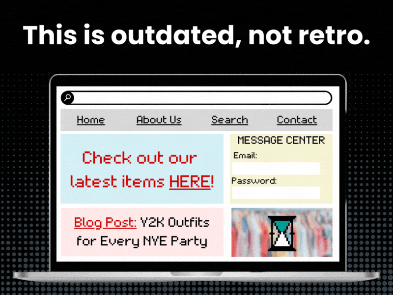
  4. Absence of a Search Function: Some visitors want to find specific information quickly without navigating through multiple pages. Without an intuitive search feature, these visitors are left in the lurch, often leading to frustration and site abandonment.
  5. Broken Links: Nothing shatters the user experience quite like broken links. Imagine your visitors' disappointment when they click on a link expecting relevant content, only to land on a 404 error page. It really kills the vibe.
  6. Inconsistent Design: A consistent navigation design throughout your website helps your visitors learn how your site works. If the design changes from page to page, it disrupts the learning process and leads to confusion, making your website harder to use.

Now that we understand the challenges, let's explore some key principles to overcome these and make your website navigation effective and user-friendly.

The ABCs of Website Navigation

  1. Simplicity is Key: The primary goal of your website navigation should be to help users find what they're looking for swiftly and effortlessly. Stick to a clean, straightforward design with clear labels and a logical structure. A good practice is to limit your main menu to a maximum of seven items (Me personally, I like to see a max of 3 items, but will add 5 to the dropdown submenu). Remember, less is more when it comes to clarity in navigation.
  2. Responsiveness is Essential: Ensure your website's navigation is fully responsive. A mobile-friendly navigation design adapts to different screen sizes, ensuring it remains clear and easy to use whether a visitor is using a desktop, tablet, or mobile device. If you're using a website building platform, choose a theme that is responsive. If you're working with a developer, make sure they understand the importance of responsive design.
  3. Declutter Your Menu: Prioritize your menu items, keeping only the most important ones. Remove outdated or irrelevant pages, merge similar pages, and ensure your labels accurately represent the content on each page. Keep your navigation menu as streamlined and uncomplicated as possible.
  4. Invest in a Search Function: A robust search function is essential for an efficient website. Ensure that it is prominently displayed, ideally at the top of your page. If your website has a large amount of content, consider incorporating filters to make the search process even more user-friendly.
  5. Fix Those Broken Links: Regularly audit your site for broken links. You can use tools like Google Search Console or WordPress plugins like Broken Link Checker. When you discover a broken link, fix it immediately. This not only improves user experience but also boosts your SEO, as search engines favor websites without broken links.
  6. Consistency is Crucial: Your navigation design should be consistent across all your pages. The position of the menu, the style of the dropdowns, the color of the links — these should all be consistent. This uniformity aids in usability and creates a cohesive experience for your visitors.

Trends in Website Navigation

As technology evolves, so does website design. Here are a couple of recent trends:

  1. Sticky Navigation: This is where the navigation bar remains visible at the top of the screen as the user scrolls down. It provides constant access to the main menu, making it easier for users to navigate your site.
  2. Hamburger Menus on Desktop: Initially a mobile-only trend, hamburger menus are increasingly appearing on desktop versions to create a cleaner look. Hamburger menus typically appear as 3 lines that pop open when clicked or hovered over. Spotify's desktop website is a good example of this.hamburger with face on wooden board lookin goofy as heck - Website navigation shouldn't feel like a maze! Uncover the pitfalls to avoid, savvy strategies to embrace, and the hottest trends that are shaping the digital landscape. Goodbye, visitor confusion! Hello, conversion success! Navigate your way to a user-friendly website and watch your business grow. - What are the key principles of effective website navigation? - your wp guy
  3. Mega Menus: Used by e-commerce giants like eBay, Mega Menus display all options in one large panel, helping users see everything at a glance without clicking through multiple levels. Mega Menus should be used cautiously, depending on the scope of your business and your industry.
  4. Voice-Enabled Navigation: With the rise of voice assistants, voice-enabled navigation is set to become a game-changer in website design. The future is exciting, isn't it?

Why Does Effective Navigation Matter to Small Business Owners?

Good website navigation means that visitors can quickly find what they want, leading to a better experience and, ultimately, more sales. In the digital world, effective website navigation improves user experience, increases session duration, and leads to higher conversion rates.

When you improve your website navigation, you make your website more user-friendly. This increased usability lowers your bounce rates, keeps visitors on your site for longer, and encourages them to return, all of which are great for your bottom line.

Final Thoughts

Navigation is more than just a website feature; it's your guide, leading your customers on their journey through your digital storefront. Keeping the navigation simple and clear helps your visitors effortlessly find what they're looking for, turning casual browsers into engaged customers. Moreover, in an era where mobile internet usage is soaring, responsiveness in website design is no longer a luxury but a necessity. It's crucial to ensure our website navigation scales seamlessly across different devices, providing a consistent and intuitive experience for all users. With the right navigation strategy, we can shape our brand's online perception, influence customer decisions, and drive further engagement.

If you're looking for expert guidance in boosting your website game, we're here to help. Schedule a discovery call with Your WP Guy. Let's take your website navigation to the next level!

What Are the Key Principles of Effective Website Navigation? Summary

  • Effective website navigation is critical in converting visitors to customers by providing a positive user experience.
  • Common challenges include complex site structure, non-responsive design, overloaded navigation menus, absence of a search function, broken links, and inconsistent design.
  • Key principles of effective website navigation include simplicity, responsiveness, decluttered menus, a robust search function, fixed broken links, and design consistency.
  • New trends in website navigation include sticky navigation, desktop hamburger menus, mega menus, and voice-enabled navigation.
  • Good navigation improves user experience, increases session duration, and leads to higher conversion rates, which positively impacts the bottom line for small business owners.
Why is effective website navigation important for small businesses?

Why is effective website navigation important for small businesses?

Effective website navigation is crucial for small businesses because it directly impacts user experience, which in turn influences conversion rates and the bottom line. When visitors can easily find the information or products they're looking for, they are more likely to stay on your website, explore further, and eventually make a purchase.

Furthermore, user-friendly navigation reduces bounce rates, keeping visitors engaged and encouraging them to return to your site. It fosters a positive perception of your brand and enhances customer satisfaction. In an era where mobile internet usage is prevalent, responsive website navigation is not just a luxury; it's a necessity to cater to users on various devices. By investing in effective navigation, small businesses can shape their online presence, influence customer decisions, and drive more meaningful engagement, ultimately contributing to their success in the digital landscape.

How can I simplify my website navigation for better user experience?

How can I simplify my website navigation for better user experience?

Simplifying your website navigation is essential for improving user experience. Start by decluttering your menu and prioritizing the most important menu items. Remove any outdated or irrelevant pages, merge similar content, and ensure that the labels accurately represent what each page contains. Keeping your navigation menu streamlined and uncomplicated makes it easier for visitors to quickly locate the information they need.

Another key step is to limit your main menu items to a manageable number, ideally seven or fewer. Clear and concise labels are crucial; they should provide a clear idea of what each section of your website offers. Remember, less is often more when it comes to navigation. A simple, straightforward design with logical organization ensures that users can navigate your site swiftly and effortlessly.

By simplifying your website navigation, you create a more user-friendly experience that encourages visitors to stay longer and engage more deeply with your content or products.

How can I make my website navigation responsive to different devices?

How can I make my website navigation responsive to different devices?

Creating a responsive website navigation is essential in today's digital landscape, where users access websites on various devices with different screen sizes. To achieve this, consider a few key strategies.

First, if you're using a website building platform, choose a theme or template that is inherently responsive. These themes are designed to adapt to different screen sizes, ensuring your navigation remains clear and easy to use whether visitors are on a desktop, tablet, or mobile device.

If you're working with a developer to build your website, emphasize the importance of responsive design. Your developer should use modern coding techniques like CSS media queries to make sure that your navigation adjusts smoothly to different screen dimensions.

Testing your website on various devices is also crucial. Use tools and emulators to preview how your navigation functions on different screens, and make any necessary adjustments to ensure a seamless user experience. Ultimately, a fully responsive website navigation enhances accessibility and usability, catering to a broader audience and improving overall user satisfaction.

How can I ensure my website's search function is user-friendly?

How can I ensure my website's search function is user-friendly?

Creating a user-friendly search function on your website is essential for helping visitors quickly find specific information. Here are some key steps to ensure your search function works effectively:

First, prominently display the search bar at the top of your webpage, where it's easily noticeable. Ensure it's easily accessible, ideally in the header or near the navigation menu.

Next, invest in a robust search engine that can handle various queries effectively. This means the search function should understand synonyms, partial keywords, and common misspellings to provide relevant results.

Consider implementing filters or advanced search options, especially if your website contains a large amount of content or products. Filters can help users narrow down their search and find what they're looking for more efficiently.

Regularly monitor and improve your search function based on user feedback and analytics. Analyze search queries to identify trends and areas where users are struggling to find information. Use this data to make adjustments and refine the search experience over time.

By prioritizing a user-friendly search function, you empower visitors to find what they need quickly and effortlessly, enhancing their overall satisfaction with your website.

How can I ensure my website doesn't have broken links?

How can I ensure my website doesn't have broken links?

Maintaining a website free of broken links is crucial for providing a seamless user experience and maintaining good SEO. Here are steps to help you keep your website free of broken links:

Regularly conduct link audits using tools like Google Search Console or website plugins like Broken Link Checker. These tools can help you identify broken links on your site quickly.

When you discover a broken link, address it promptly. Either update the link to the correct URL or remove the link if it's no longer relevant.

Pay attention to external links as well. Over time, external websites may change their URLs, leading to broken outbound links on your site. Regularly check and update these links.

Consider setting up redirects for outdated or changed URLs. This ensures that even if users click on an old link, they are directed to the relevant content, preventing 404 errors.

Maintaining a website with no broken links not only improves the user experience but also positively impacts your website's SEO. Search engines favor websites with up-to-date, error-free content, which can lead to better rankings and increased visibility.

Why is design consistency crucial for website navigation?

Why is design consistency crucial for website navigation?

Design consistency in website navigation is vital because it creates a cohesive and intuitive user experience. When the design elements, layout, and navigation style remain consistent across all pages of your website, it helps users understand how your site works and find their way around more easily.

Consistency extends to various aspects of navigation, including the position of the menu, the style of dropdown menus, the color and formatting of links, and the overall visual theme. When these elements remain uniform, users don't have to relearn how to navigate your site when they move from one page to another.

Moreover, design consistency reinforces your brand identity. It communicates professionalism and attention to detail, which can enhance trust and credibility in the eyes of your visitors. Ultimately, a consistent navigation design simplifies the user journey, reduces confusion, and contributes to a more pleasant and effective website experience.

What are some recent trends in website navigation design?

What are some recent trends in website navigation design?

Website navigation design continually evolves to meet user preferences and technological advancements. Here are some recent trends:

  1. Sticky Navigation: Sticky navigation involves the menu bar remaining visible at the top of the screen as users scroll down the page. This constant access to the main menu simplifies navigation and provides a seamless browsing experience.

  2. Hamburger Menus on Desktop: Originally popularized on mobile devices, hamburger menus (three horizontal lines that expand into a menu when clicked or hovered over) are now appearing on desktop websites. They create a cleaner and more minimalist look, enhancing the overall aesthetics.

  3. Mega Menus: Mega menus are large, expandable menus that display multiple options or subcategories at once. They are often used by e-commerce websites like eBay to help users quickly access a wide range of content or products without navigating through multiple levels.

  4. Voice-Enabled Navigation: With the growing use of voice assistants like Siri and Alexa, voice-enabled navigation is emerging as a significant trend. Websites are starting to integrate voice commands to enhance accessibility and provide a unique browsing experience.

Why is website navigation essential for the future of online business?

Why is website navigation essential for the future of online business?

Website navigation plays a pivotal role in shaping the future of online business for several reasons:

  1. Enhanced User Experience: As online competition intensifies, providing an exceptional user experience is critical. Effective navigation ensures that visitors can quickly and effortlessly find what they need, leading to higher satisfaction and a higher likelihood of returning.

  2. Mobile Optimization: With the increasing use of smartphones and tablets for online activities, mobile optimization is a must. Responsive navigation design ensures that your website functions seamlessly across various devices, catering to a broader audience.

  3. Improved SEO: Search engines prioritize user experience, and broken links or confusing navigation can harm your SEO rankings. An optimized navigation structure and design can positively impact your search engine rankings, driving more organic traffic to your site.

  4. Conversion Rates: Effective navigation simplifies the path to conversion. Whether you want visitors to make a purchase, sign up for a newsletter, or contact you, a user-friendly navigation system guides them through the process smoothly, increasing your conversion rates.

  5. Voice Search and Assistants: With the rise of voice search and voice-enabled devices, having intuitive navigation is crucial for businesses aiming to leverage this technology. Clear and concise navigation helps voice assistants understand and fulfill user requests more accurately.

How can effective website navigation impact a small business's bottom line?

How can effective website navigation impact a small business's bottom line?

Effective website navigation can have a substantial impact on a small business's bottom line in several ways:

  1. Increased User Engagement: A user-friendly navigation system encourages visitors to explore your website further. When users can easily find what they're looking for, they are more likely to stay longer, browse more pages, and engage with your content or products.

  2. Higher Conversion Rates: Streamlined navigation simplifies the path to conversion, whether that means making a purchase, filling out a contact form, or subscribing to a newsletter. When the process is straightforward, visitors are more likely to take the desired action, leading to higher conversion rates and increased sales or leads.

  3. Reduced Bounce Rates: Clear navigation reduces bounce rates, which occur when visitors leave your site quickly after arriving. Lower bounce rates indicate that visitors are finding value and relevance in your content, which can positively affect your search engine rankings and online reputation.

  4. Improved Customer Retention: When your website is easy to navigate, visitors are more likely to return in the future. This can lead to loyal customers who repeatedly engage with your business and make repeat purchases.

  5. Positive Brand Perception: Effective navigation contributes to a positive brand perception. Visitors associate a smooth and user-friendly experience with professionalism and trustworthiness, which can lead to increased brand loyalty and positive word-of-mouth referrals.