
What is a phone ready website design called?
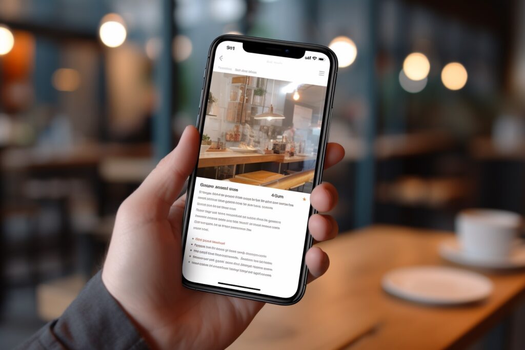
Pull up your website on your phone right now.
We will wait.
Does the menu work? Are the buttons easy to tap? Does the text fit on the screen, or are visitors pinching and zooming just to read your homepage?
Tired of hearing "your site needs to be mobile-friendly" without anyone explaining what that actually means? Worried that more than half of your visitors are bouncing off your site because it looks broken on their phone? Wondering whether you need a separate mobile site, an app, or something else entirely?
The answer to all of it has a name: responsive web design. Here is what it actually is, why it matters, and what to do if your site doesn't have it.
You've got a business to grow. We can handle this website stuff, including making sure it looks great on every screen.
TLDR; A "phone-ready" website is officially called a responsive website. Responsive design means your site automatically adjusts itself to look beautiful and work perfectly on any screen size, from phones to tablets to laptops to giant desktop monitors, without needing a separate mobile version. In 2026, it isn't optional. It is the baseline expectation for any website that wants to actually serve its visitors.
So What Is Responsive Web Design, Exactly?
Responsive web design is a way of building a website so that the layout, images, text, and navigation automatically rearrange themselves to fit whatever device the visitor is using.
One website. Every screen size. No weird sideways scrolling, no microscopic text, no buttons too small to tap.
When done right, responsive design is invisible. Your visitors just have a great experience, whether they are on their iPhone in line at the coffee shop or their massive desktop monitor at the office.
Why It Matters More Than You Think
Most people abandon a site that takes longer than 4 seconds to load. The same is true for sites that are frustrating to use on a phone. Visitors don't try to figure out a broken mobile experience. They just leave.
And here is the kicker: more than half of your traffic is on a phone. Maybe more, depending on your industry.
If your site doesn't work great on mobile, you are silently telling more than half of your potential customers that you don't really want their business. Even if you do.
What Responsive Design Actually Does
Behind the scenes, a responsive site is paying attention to the device a visitor is using and adjusting on the fly. A few examples:
- The menu might collapse into a tidy hamburger icon on a phone, but show a full horizontal menu on a desktop.
- Images might shrink and rearrange to keep the page from feeling cramped on a small screen.
- Text might increase in size and spacing on mobile so it stays easy to read without zooming.
- Buttons might get bigger and more touch-friendly so visitors can tap them with their thumbs.
- Multi-column layouts might stack into a single column on a phone for clean vertical scrolling.
All of it happens automatically. The visitor doesn't know they are seeing a different layout. They just know the site works.
Why Responsive Design Beats a “Mobile Version”
Years ago, businesses used to build entirely separate mobile versions of their sites (often at a different URL, like m.yoursite.com).
Don't do that. It was a workaround for a problem that responsive design has now solved properly.
Separate mobile sites mean:
- Twice the maintenance work
- Inconsistent experiences between devices
- Worse SEO performance
- Higher costs and more headaches
Responsive design fixes all of it with one site that works everywhere. Cleaner, simpler, more flexible, and far easier to keep current as your business evolves.
The SEO Side of the Story
Google plays a big part in why responsive design is so important.
Google ranks websites based on how mobile-friendly they are. A site that works beautifully on a phone gets rewarded with better search rankings. A site that doesn't gets quietly buried.
In other words, ignoring mobile isn't just costing you visitors who land on your site. It is costing you visitors who never even get the chance to find you in the first place.
How to Tell If Your Site Is Actually Responsive
Three quick checks anyone can do:
- Pull up your site on your phone. Does it look like a polished version of your desktop site, just sized for a smaller screen? Or does it look squished, broken, or full of tiny text?
- Resize your browser window on a desktop. Drag the edge to make the window narrower. Does the layout adjust gracefully, or do things break, overlap, or disappear off-screen?
- Run Google's free Mobile-Friendly Test. Just search "Google mobile friendly test" and plug in your URL. It will tell you in seconds whether your site passes.
If anything looks off, your site probably isn't fully responsive. And that is something worth fixing soon.
Ready for a Site That Looks Great on Every Screen?
Your customers need your attention. You need your website to work, on every device they pull out of their pocket.
If you would like help making sure your site is properly responsive (or building a new one that is responsive from day one), we would love to help. Click here to schedule a no-obligation consultation. We will walk through your site with you, point out what is working, and show you exactly where there is room to grow. No pressure, no jargon, just a real conversation.
We are experts in website design, website support, and website traffic.
Schedule a consultation or call us today: 678-995-5169